Friday 20 December 2013
Filming - Woods - Day 1 JB
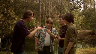
Today we had our first day of filming in Sydenham woods. We ended up getting around two thirds of our filming done which is around what we expected. We filmed more than just our shot list so we have a few extra bits of footage we may use instead of the ones on our shot list. We started at 10am as planned and finished at around 2:30pm. It was hard to get everyone to show up on time but apart from one girl not showing up everyone was on time and arrived in suitable costume as well as behaving well. There were a few places we had to slightly change the location inside the woods because of wet benches etc. We are going to have to do one more day of filming in the woods, planned for Monday 23rd December but if there is rain that day we will have to reschedule.
Tuesday 10 December 2013
Plans for Graphics EA
FONTS:
Here are some examples of other fonts I am considering using for our title sequence.


These are all great horror type fonts which Josh and I will be thinking of using for our title.
COLOR SCHEME:

We will probably be inclined to make our horror poster have a dark colour scheme with red writing, this tends to be the typical horror standard and it works to a good level. However this really does depend on the image we want to use for our poster, we will do some research into what images our target audience like best to find out.
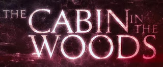
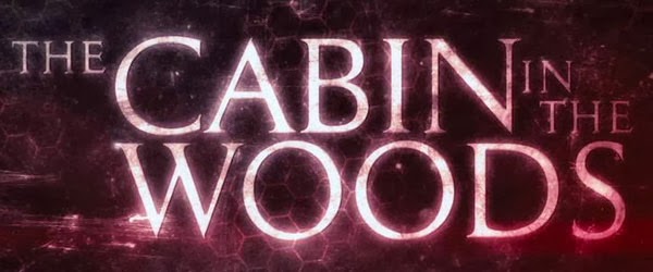
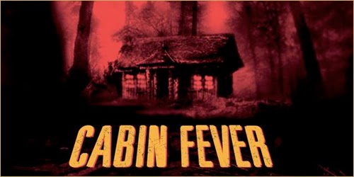
 As you can see for the cabin in the woods title sequence they like to stick to the red writing for the colour scheme which works very well, it lets the audience know that it is a horror.
 FILTERS:
SOUND:
For our narrative titles we have a few examples of things that we might want to use, the sounds in these narrative titles tend to be quite simple such as a drum or a sudden sound. The cabin in the woods has a perfect example of the type of sound we want to use for our narrative title slides at around 0:46, it is a quick short sound which accompanies the text saying "You think you know the story". The same again happens at 0:54, this is perfect for what we are doing because it is quite easy for us to do and it can achieve great dramatic effect. Here is the video below.
MOVEMENT:


Movement is crucial in our title sequence, there should not be too much because they are supposed to be very quick points of information which get the audience involved and thinking. The examples you have seen from the cabin in the woods at times 0:46 and 0:54 are excellent ways of showing a narrative title, the way that only a bit of the writing appears at first and then the rest comes after, this builds tension and adds effect.
Monday 9 December 2013
Research into industry of media magazines JB
On the Bauer Media website Empire magazine is described as
"the premier movie destination, providing indispensable insight into cinema, both blockbusting and classic. Online, in-print and via app EMPIRE’s unparalleled access has led to world-beating exclusives such as the first look at Heath Ledger’s Joker, to extraordinary access to Steven Spielberg who guest edited our 21st birthday issue, to George Lucas’s backyard in the run up to Indiana Jones and the Kingdom of the Crystal Skull."
Saturday 7 December 2013
Little White Lies Magazine Cover Evaluation JB
Thursday 5 December 2013
Title Planning JB
One film that has influenced a lot is The Cabin in the Woods. This title doesn't play much with anything and gives an overview of the film very literally.
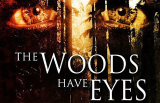
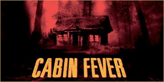
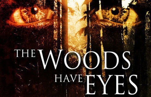
Other films that are similar to ours are The Woods have eyes and Cabin Fever, who's titles are posted below
We are going to use these sorts of ideas for our title including the word Woods and giving them characteristics of a human we think is quite effective. Below are some title ideas.
"Don't stray from the path" with a tagline (or you may never return)
"The Deep Woods"
"The Dead Forest"
"The Dead Leaves"
"The Forest of Decay"
"The Forest sleeps" with a tagline (but it's inhabitant doesn't)
"The Fallen Leaves"
"The Hunting"
"Nightfall"
Poster Interview 2 EA
Below is an interview we conducted on 6 film posters that are similar genres to ours.
Organising Filming JB
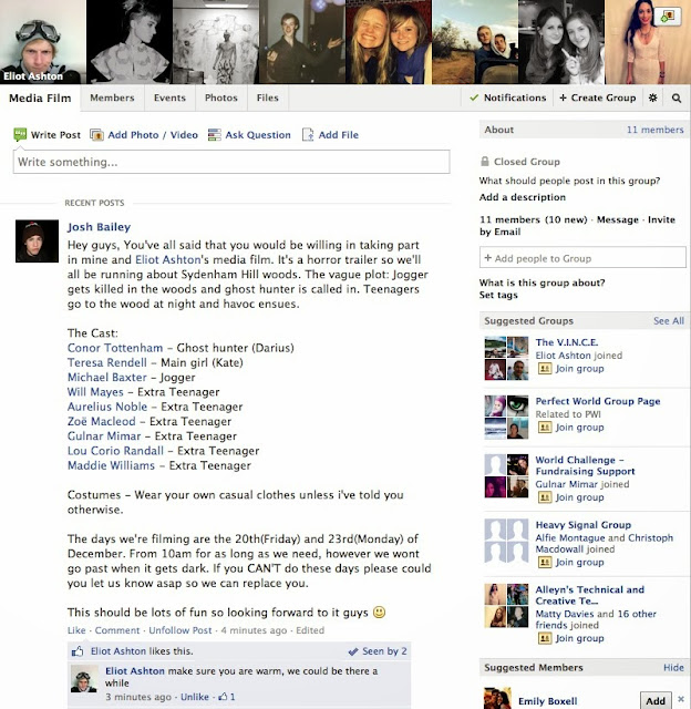
I've created a Facebook group to get everyone organised and let everyone know when we're filming, where and who's playing who. This is shown by the photo below.
Wednesday 4 December 2013
Poster Survey JB
60% of the people asked didn't like horror films, all of which were females.
40% of the people asked did like horror films, all of which were males.
The Skeleton Key -
When asked what most liked about the poster some answered with the eye image and one with the tree image. Some also answered that they didn't like the poster.
When asked what the poster made them feel some answered that it made them feel intrigued. Two people said that it made them not want to watch the film. Another said it made them feel worried for the person in the wheelchair.
Insidious -
When asked what most liked about the poster most of them said they liked the boy's eyes and the way the poster played with shadows and contrast of light and dark.
When asked what the poster made them feel a couple answered with annoyed/confused. One said it looked more like an alien film poster and the rest said it made them not want to watch it.
The Cabin in the Woods -
When asked what most liked about the poster most said the house image and the idea of it being like a puzzle or rubix cube. One also said they liked the brightness of the poster.
When asked what the poster made them feel most said excited or intrigued about the house. One said that it didn't make them feel much.
Case 39 -
When asked what most liked about the poster most of them said that they didn't like it at all and one said that they liked the simplicity of it.
When asked what the poster made them feel most said they didn't like it and it didn't make them feel much.
The Conjuring -
When asked what most liked about the poster most said they liked the simplicity of it and others said they liked the doll and the fact the only colouring is on her.
When asked what the poster made them feel all of them answered scared or creeped out.
The Blaire Witch project -
When asked what most liked about the poster most of them answered that the writing left them wanting more or the close up of the face was the best bit.
When asked what the poster made them feel some of them said intrigued about the writing or the symbol. Others said nothing at all.
The most liked poster was The Conjuring and the second most liked poster was The Cabin in the Woods.
When asked whether the fact a film is based on a true story makes them like it more 90% of them answered with yes as it makes it more interesting or scarier. One answered no because they said they don't really believe it.
When asked whether the names of actors/directors on the poster make them want to watch it more all of them said yes if it was an actor they liked or the director of another famous film or one they liked.
Tuesday 3 December 2013
Poster Interview 1 JB
Below is an interview we conducted on 6 film posters that are similar genres to ours.
Script JB
We are going to have some talking in our film and so we've written a script below that we are going to roughly follow.
The first dialogue is between the policemen(P) and the ghost hunter(GH):
P1: There's been an accident in the forest, it's.. not.. ordinary
GH: How so?
P2: He means to say Sir, that we believe this to be a murder of the supernatural kind.
GH: Show me.
(On scene or voiceover)
GH: There's something wrong here.. I don't like this
The next dialogue will be the voiceover of one of the kids talking about the woods
"Did you guys hear about the jogger who died in these woods the other day? Some people say it wasn't human what killed him... I've heard stories about these woods. I've been told there's something that lives here who feeds on people. He picks on the weak first, and the ones who don't believe his tale, he hides in the trees and in the bushes and when your guard is down he STRIKES."
Schedule for filming JB
We have decided to film during the following dates: 19th, 20th, 21st and 22nd of December.
We've checked all our cast members are free during this date and we should be ready to go to start filming. We've got our equipment including:
Camera
Tripod
Two Lights, each with two battery packs
Audio recorder
Directional mic + extension pole
Headphones
We've checked all our cast members are free during this date and we should be ready to go to start filming. We've got our equipment including:
Camera
Tripod
Two Lights, each with two battery packs
Audio recorder
Directional mic + extension pole
Headphones
Different ideas for ident EA
I have decided to call our indie company Fairly Frightening Films primarily for the alliteration but also because it has some comic value. For my first idea I was just getting the feel for motion, motion is a professional package and can be quite difficult to use.
As you can see from this small clip it is not particularly well made however there are a few different parts of motion which I began to experiment with. To start I took an image of a knife off the internet and put it in motion. After this I wanted to see what i could do with text so I created a text box and wrote 'The Woods' in, this is because Fairly Frightening Productions would have been too big. I added a 'drip' effect to the text and then changed the glow to red, this made it look like blood dripping. Another reason I did not use Fairly Frightening Productions was because there were too many letters and the dripping got a bit out of hand. Finally I made a custom animation where I drew a motion track line and then attached an image of a light to it. The light grows and shrinks in intensity and size as it travels up the knife.
My second ident is not as creative because I already made my own template from earlier when I was just getting to grips with Motion. All I had to do was adjust the length of the animation, change the text and add the bad film effect to the text so it fits in with the picture behind.
For my final piece I was intent on getting blood involved because it makes it much more scary, this is probably the most simplistic of all three however I feel it is also the strongest. Used Final Cut Pro to create the animation for the text and saved it as a video file on my desktop, I imported it into motions as a piece of film and then used a free blood animation which I found on the internet and layered over the text.
Influences for Graphics EA
The Conjuring:

The conjuring has a more documentary style title sequence which can be incredibly effective, especially considering that the conjuring is based on a true story. The documentary style title sequence tends to have a grayscale color scheme, this old fashioned technique can be quite fear enspiring. Moreover it is usefull to get out as much information as possible in a short amount of time setting the film up, introducing the plot and characters. The font in these slides are all easily read except the titles of the pages, which are not particularly relevant to the cast and directors however it is of use to give background information on the plot line hence lines like "haunted artifacts museum".
Cabin In The Woods:

The cabin in the woods is set in a wood, however the title sequence does not show any of these woods. As you can see the title sequence is used to establish what is going on, therefore they show the interior of the organisation behind the intricate murders of the youngsters. The text is very legible and tends to be in block fonts which are large and attention grabbing. Moreover the text tends to be all rather central which makes it even more captivating. The colour scheme has a re-occuring red theme which is the typical 'horror colour' seen as it is the same colour as blood, we also see black, blue and grey. The blue and grey are for a more satirical approach to the horror genre as it tries to illustrate the lame life these workers lead in comparison to that which you experience later in the film.
Evil Dead:

The Evil Dead title sequence is very typical for a horror, the colour scheme is red and black which are both fear inspiring and signify blood and darkness. There is a lot of blood in the title sequence which I think we would be able to animate for our title sequence effectively. I have tested some blood animations in motion which seem to work well. The text is large, not particularly central and in block capitals. The reason they have not made it all central is because they don't need to, the titles are attention grabbing enough with them being in bright red and capitals as it contrasts from the black background, also the animations which appear centrally are important and provide the eerie horror feel to the sequence. The title of the film has looks as if it has been scratched away which provides a really nice look which I would also be interested in experimenting with or perhaps even using.
Thursday 28 November 2013
Plans for Ident
The ident is a crucial part of our media studies project, I have found a few examples of idents that we are keen on taking ideas from.
This is a small ident for UK film council, this is not a particularly small company however I like the design and effects they use for their ident. The colour scheme is well thought out but I don't think that it will convey our indie company as a horror film producer. The effects they use are such as the writing coming out of the tear in the middle. An ident that is more horror orientated would be the Dark Castle Entertainment ident at 0:28, they use a gargoyle which tends to be associated with horror films. The colour scheme is much darker, it has a grey/brown feel. The transformation of the gargoyle into the castle as it zooms out is something we are interested in doing, the way it zooms out showing more perhaps showing our title. Further on at 1:30 we see a transition between idents, to do this they use some clouds floating in front of them, the clouds are an easy technique we would easily be able to use so it is definitely worth considering for our final ident.
Mutant enemy productions are a indie ident production company, they have actually made an animated ident. I think this is actually really effective because it is unique, moreover it is easy to do seen as it requires little knowledge of editing softwares such as motion or final cut pro. It is also quite comic, the sound used on it is just a person making a sigh noise, I have looked into comic horrors like the cabin in the woods and their genres seem to meet. As much as I find this comic aspect good it is probably worth not using because we want our trailer and ident to actually be scary.
Tuesday 26 November 2013
Sound JB
Sound is a massive part of our film. We are going to use lots of different foley sounds, 3 different soundtracks and also diegetic sound. Below is a soundscape of lots of different foley sounds that we could possibly use in our film. I've downloaded these off of various different copyright free sound websites. They're saved onto my hard drive and in the editing process I may come back and use them, or look for some more. There is also a wide range of foley sounds already installed on Final Cut Pro that I can use.
As we also need to use music soundtracks i've researched a few different soundtracks as well. Below are a few different soundtracks that i've got from either YouTube or different copyright free websites. With the YouTube videos i've asked for permission to use them in my film and the people who own the songs have accepted this use.
This video is a horror movie soundtrack someone made for their media product and eventually didn't use, they said to message them if anyone wanted to use it so this could be a potential use for our film.
Below is another horror movie soundtrack that's on YouTube. This one is available for use in anything but for a small price, so this could also potentially be a use for our film.
Below is a long copyright free soundtrack I've found online. It is a very long soundtrack and goes through several different moods and tones and so I could definitely use some of this and not others for my films. I've also layered some other sounds on top of it during the first two minutes which has shown me it's quick to make the soundtrack sound even better and so I will do something very similar for my final piece.
Thursday 21 November 2013
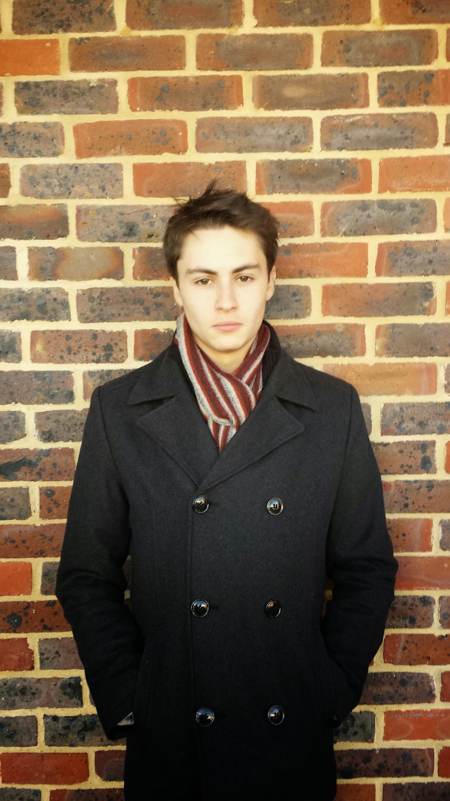
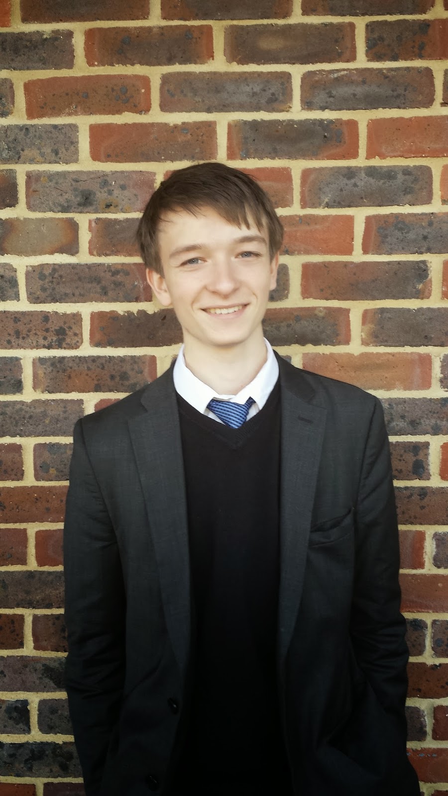
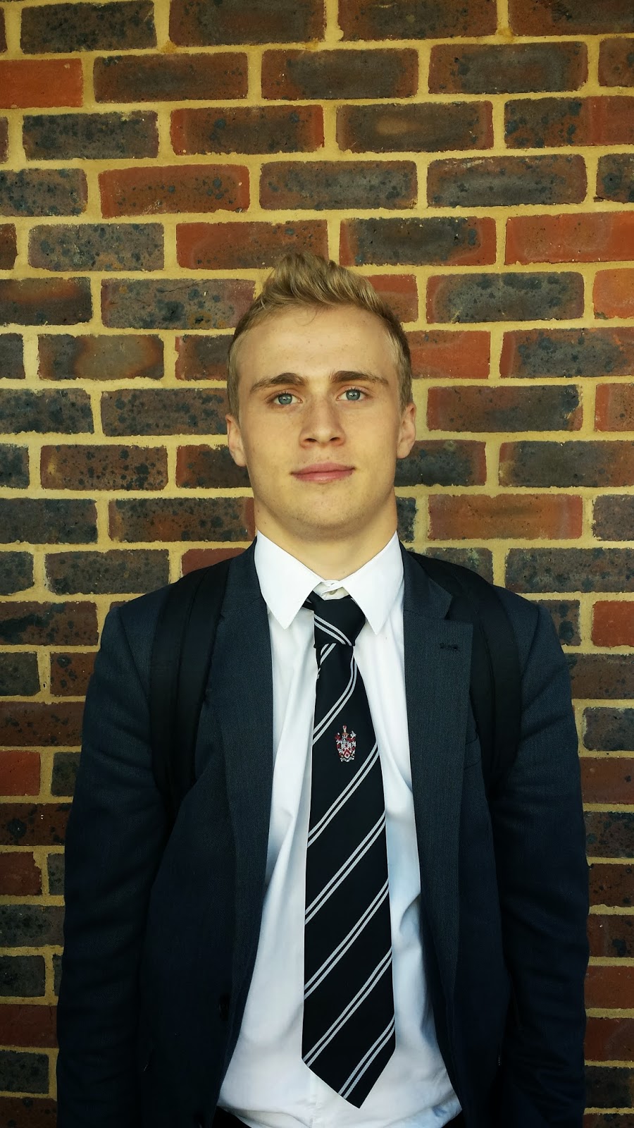
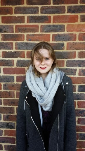
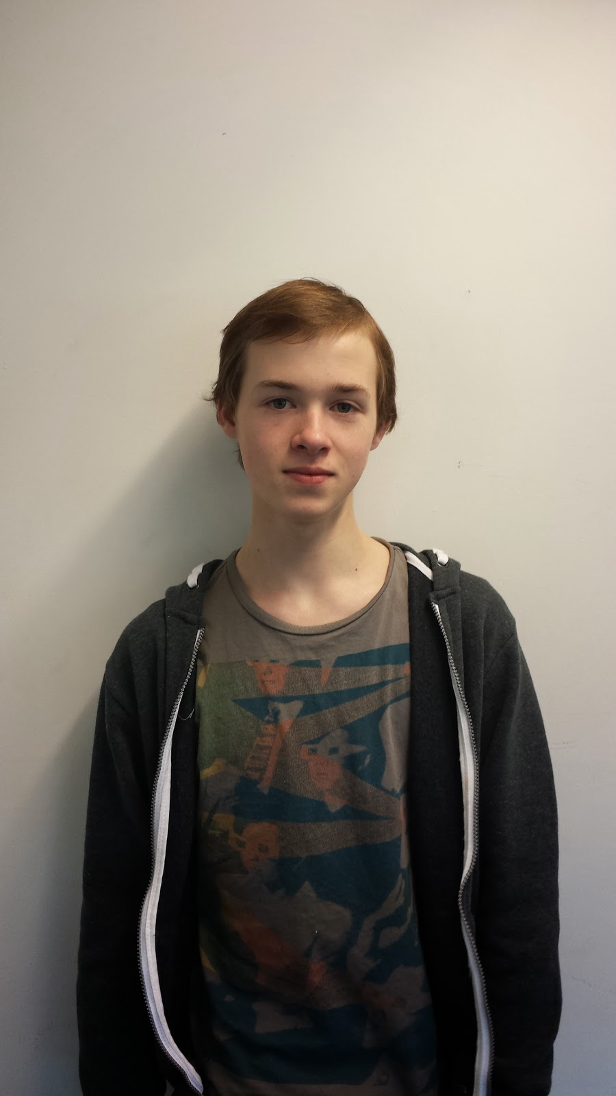
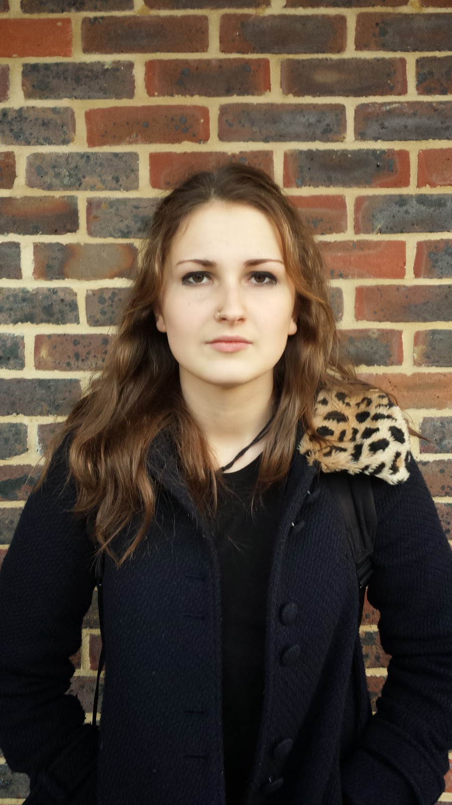
Cast JB
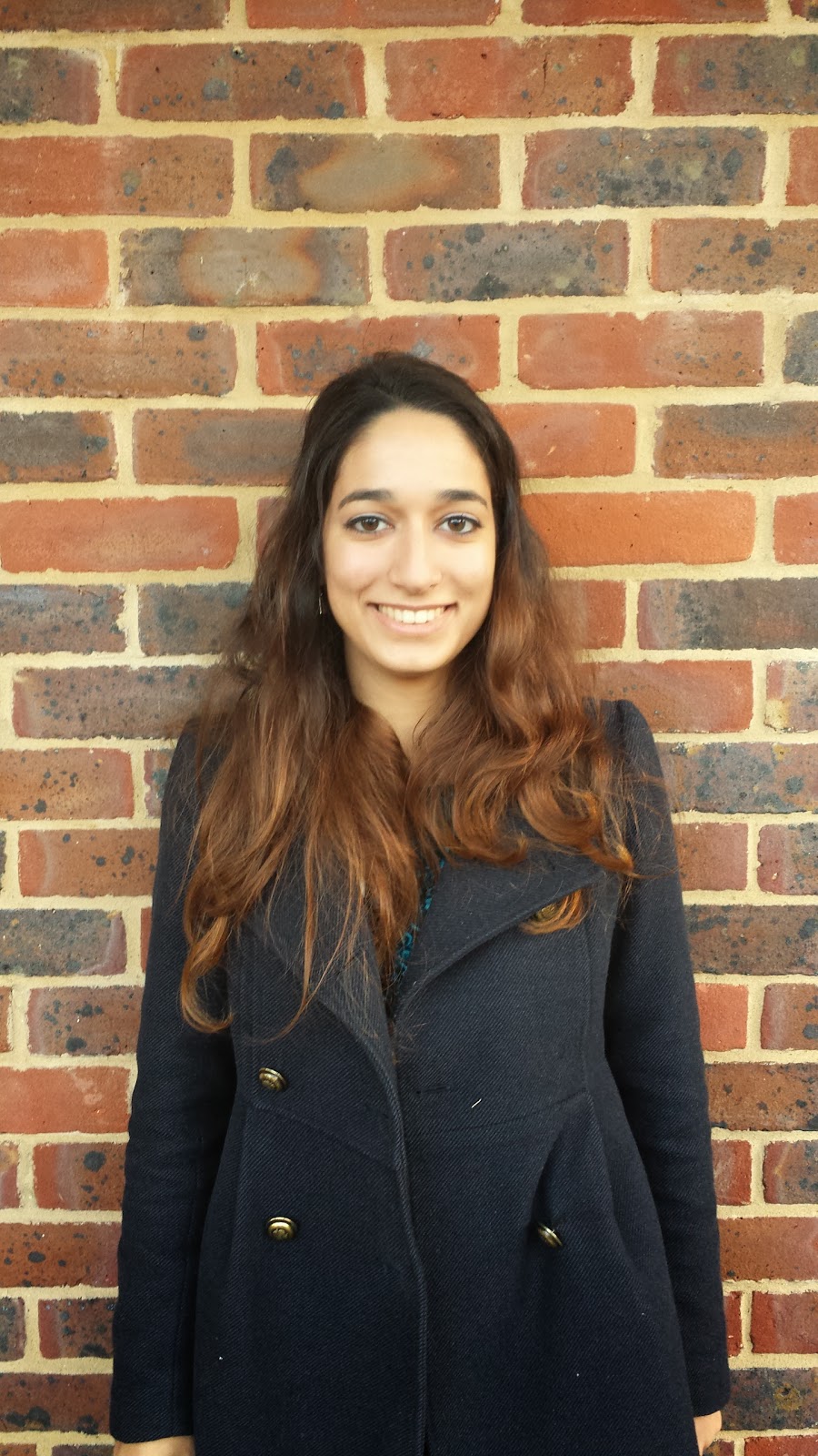
Zoe Macleod is another actress we've chosen to be an extra teenager. We don't need to focus much on her as she won't be a huge role but she looks old enough to fit in with the group and doesn't look similar to the rest of our cast and so gives our characters more definition.
Gulnar Mimaroglu is another actress we've chosen to be an extra teenager. Again she's not a huge role in the film so we don't need to focus much on her. However she has a distinct different look from the rest of the cast, giving our characters a more defined feel.
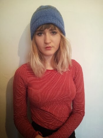
Maddy is an extra girl we've chosen to be in our film. She looks around the same age as the rest of our cast and has a completely different look as well. She's not a huge role and so not much thought went into her but we think she'll look good in the film.

Lou is an extra boy we've chosen for our film as he's quite old looking and looks different to most of our other cast members. Again he's not a huge role and so we didn't put much thought into choosing him but we think he'll look good on camera and will cooperate well.
All of the cast have been selected carefully so that none of them are similar at all and so the trailer, like most horror trailers, lets you see that each character is very much seperate and fall into certain categories. They're all sensible people and are more than willing to help out, so we can film with them very easily. They're also all free during the first week of christmas holidays which is when we've decided to film.
Tuesday 12 November 2013
Picture Editing Ideas EA
I have taken this picture of Sydhenem Hill Forest and edited it in motion.
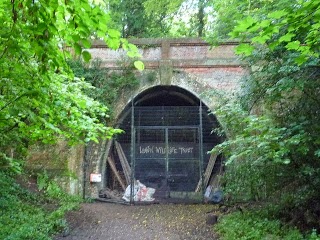
I have added a filter called bad film, this makes the image look grey and pixelated. I copied and layered more of the same bad film filters and increased certain features of each one such as focus, focus variance, jitter and jitter variance. This makes it have a climax at around 4 seconds through, I added a small face that appears briefly just to test my ability to use motion. The face looks scary however it was still not very well executed, I added the bad film filter to the image of the face however this did not help it blend in, instead I turned the opacity of the image down and gave it a quick fade in and out which made it look more natural and less forced. Because I used the bad film filter I figured it could be in my interest to add the timecode in the left corner of the screen and see if I can make it fit to show that the scene is being filmed. I grouped the timecode with the image so it did not look layered and so it shares the climax. Finally I wanted to experiment with text in the motion package, I added the text "THE WOODS" in the calligraphic font. I added the text to the same group as the timecode and picture to make it seem more smooth and so I did not have to edit each piece separately.
Tuesday 15 October 2013
Tuesday 8 October 2013
Day for night filming JB
The YouTube video below explain how to do Day for Night filming on a camera. I would like to test this to see if it would work for my film. There are several different ways I could film it. It could be day for night using the camera, day for night using final cut pro, day for night using both, or I could film at night. I am going to test all of these options out and decide which one would be best for my film.
Thursday 3 October 2013
Rough shot list JB
Shot list
- Police officers and ghost hunter in the office talking about the jogger, mid shot, flash to below shots, whilst this is happening could have some voice over of the police explaining what happened.
- Close up of jogger’s ipod turning music on.
- High shot of jogger running, perhaps from a tree.
- Police investigation scene - POV shot of policeman writing notes
- Mid shot of jogger running past trees. Close up of his face, perhaps before this a whip pan, giving the impression someone is there. He stops, looks confused and looks around a few times, then carries on running. Perhaps camera moving around him.
- Mid shot of police officer asking ghost hunter about it.
- POV shot of him running.
- Close up of ghost hunter looking down at body
- Another shot from beasts perspective, jumping on jogger, then a black flash
- Mid/High shot of ghost hunter telling policemen it's probably supernatural, they laugh/don't believe him
- A shot of the jogger lying on the floor, tracking away from him and giving a view of woods.
- Blank screen again maybe more writing
- Close shot of someone texting "Wanna come to the woods"etc
- Mid shot of girl in her bedroom getting ready to go out
- Long shot of group of teenagers entering the woods laughing
- Close up of sign saying do not enter, just before the crime scene
- Mid shot of girl looking worried, doesn't want to enter, then a boy grabs her and says it'll be fine and takes her into the woods with them
- Long shot of teenagers sat in a circle drinking and laughing
- Close up of one kid telling a ghost story about these woods being haunted and the jogger who died recently. - This could voiceover the next few shots
- Close up of other kids saying they don't believe it, maybe one of the girl looking a bit worried
- Mid shot of kid - Music change and kid gets grabbed out of the circle and screaming insues
- Various different mid shots/close up of teenagers running in different directions
- 2 more get picked off, mid shots of them being pulled maybe behind a tree and then screaming
- A girl and boy running, close up of their faces running
- Mid shot ghost hunter typing on computer
- Could have a close up of computer screen, - NEED MORE INFORMATION
- Close up ghost hunter look a little worried
- Mid shot ghost hunter get angry and grab his coat and leave.
- Mid shot ghost hunter walking into wood
- Screaming, close up ghost hunter like what is this voice
- ghost hunter run into wood to save little girl
- close/mid shot girl backing away from yet another dead body.
- Cut to ghost hunter holding up some sort of gun, mid shot, girl behind him looking scared
- Ghost hunter holding girl whilst she shakes and cries/ bit of sexual tension, maybe almost kiss
- Cut to both sitting under the bridge, mid shot, tracking in, slow long shot, holding head in hands
- Cut to jumpscare possibly monster jumping from a tree etc
Tuesday 1 October 2013
Aesthetics and Visual Style JB
Most horror films have particulars styles and aesthetics. They are all very similar styles and I'm going to take a look at some of the conventional aesthetics for horror and then look at how ours would look.
The colour pallet for horror films is usually dark colours, with a lot of red, either blood or other. The darkness of the pallet helps the audience becomes more scared as it creates a sense of unknown and gives more mystery to the look. The colour red is either a use of blood or a sign of fire or anger and because of this, this colour is prominent in most horror films. Examples of this is below.
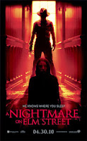
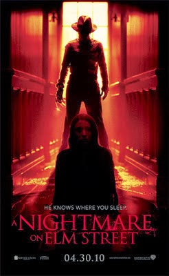
A Nightmare on Elm Street is a classic horror and even the poster shows mostly red and black, showing both the conventions I stated above.
Most of the locations for horror films are pretty similar as well. Most of them take place in a singular house, or perhaps abandoned mansion/hospital. However lots of them also take place in forests. This is the main location for our horror film and so in this way it is similar to other horror aesthetics. An example of a horror film taking place only in woods is The Cabin in the Woods or The Woods Have Eyes. Pictured below.
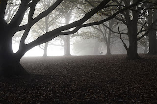
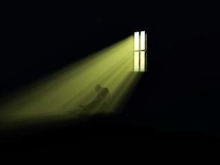
.jpg) All of these lighting techniques work really well. The first one represents an ideal lighting set up for my film, giving an ominous look with the mist and woods. However this would be very hard to achieve as I would have to film it all on a misty day. The colour pallet is also very similar to one I would be using, it mostly being grey and black. The second picture I think works really well for horror films, the classic sunlight shining in through a window, onto a figure. This works because you can't see any of the rest of the room and you can barely see what the figure is so it gives an intense mystery feel. This again might be difficult to do unless I found the perfect location. The third picture, from friday the 13th has used light coming in from the side, again from a window to show up certain bits of the frame. You can see vividly the window curtains, her face seems as if it's lit from below, and you can see the enemy right behind her, only his face lit up though. This creates a sense of mystery but would probably be the most you'd see of the enemy at once in this film or mine, perhaps used for a jump scare. I would definitely like to use the light coming in from the side idea, maybe coming around the corner from car headlights or something. The last picture has lighting from above and to the side. This works well by lighting up most of the surroundings giving a sense of location, but at the same time keeping the figure in the middle fairly unlit and giving it a spooky feel. This would be a good technique to use, I would have a figure standing in the middle of the frame with light coming from most angles, so you can see most of the wood, but not much of the figure. The figure could also have his back turned and then turn around for a jump scare.
All of these lighting techniques work really well. The first one represents an ideal lighting set up for my film, giving an ominous look with the mist and woods. However this would be very hard to achieve as I would have to film it all on a misty day. The colour pallet is also very similar to one I would be using, it mostly being grey and black. The second picture I think works really well for horror films, the classic sunlight shining in through a window, onto a figure. This works because you can't see any of the rest of the room and you can barely see what the figure is so it gives an intense mystery feel. This again might be difficult to do unless I found the perfect location. The third picture, from friday the 13th has used light coming in from the side, again from a window to show up certain bits of the frame. You can see vividly the window curtains, her face seems as if it's lit from below, and you can see the enemy right behind her, only his face lit up though. This creates a sense of mystery but would probably be the most you'd see of the enemy at once in this film or mine, perhaps used for a jump scare. I would definitely like to use the light coming in from the side idea, maybe coming around the corner from car headlights or something. The last picture has lighting from above and to the side. This works well by lighting up most of the surroundings giving a sense of location, but at the same time keeping the figure in the middle fairly unlit and giving it a spooky feel. This would be a good technique to use, I would have a figure standing in the middle of the frame with light coming from most angles, so you can see most of the wood, but not much of the figure. The figure could also have his back turned and then turn around for a jump scare.
The colour pallet for horror films is usually dark colours, with a lot of red, either blood or other. The darkness of the pallet helps the audience becomes more scared as it creates a sense of unknown and gives more mystery to the look. The colour red is either a use of blood or a sign of fire or anger and because of this, this colour is prominent in most horror films. Examples of this is below.
A Nightmare on Elm Street is a classic horror and even the poster shows mostly red and black, showing both the conventions I stated above.
Most of the locations for horror films are pretty similar as well. Most of them take place in a singular house, or perhaps abandoned mansion/hospital. However lots of them also take place in forests. This is the main location for our horror film and so in this way it is similar to other horror aesthetics. An example of a horror film taking place only in woods is The Cabin in the Woods or The Woods Have Eyes. Pictured below.


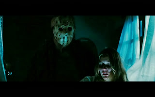
The lightning in horror films is one of the most important aspects of the genre. The lighting can create a really scary atmosphere. The lighting in most horror films are very similar. They're all have a grey dull colour pallet as they are meant to have a moody feel, and make you tense or uneasy, which is why the grey colour is good as you can't always tell what's happening. The lighting i'll use in my film will mainly be natural, like you can see above, as the woods bring an ominous glow to the light when it's natural, and you get it split up by the trees giving a detached broken feel to the light. During the night scenes I may use some lights on people's faces to bring out their emotions, but never full on, to the side of their face so you can only just see what they're thinking/feeling giving a tense mystery. Some interesting lighting in horror films are pictured below.


The framing in horror films is also used to much effect. Usually the characters are in the centre of the frame, as you can see from the two pictures above from The Cabin in the Woods and The Woods Have Eyes. They also seem to have not much around them, and in the last picture when I was talking about lighting the positioning is again centre frame with empty space around them. This gives a creepy feel as you have a sense of absence around them.
Trailer Acts Analysis EA
We've analysed the three acts of several horror films below. We will try and apply this structure to our narrative.
The Conjuring
Act 1
Act 1
Act one is the introduction to the film, it tends to have a description of what happens in it and brings in the characters. The trailer for 'The Conjuring' it begins with a hand held documentary-esq video on what happens, for instance they are being filmed asking a supernatural entity if it is there and using electronic voice recording to try and contact the entity. There is a small moment of strange happenings where the piano begins to play. Then it cuts to the two demonologists giving a lecture on who they are which is clever because in them informing the in film audience it also informs the out of film audience.
Act 2
The second act would begin at just about 50 seconds in, this is when there is a change of tone and it tells the audience what the problem in the film is. There is screaming and tension building, the narrator actually says what the issue is "This family has been experiencing supernatural occurrences". The pace picks up a bit to lead into act 3. They give a bit more background information however it is more specific to the enigma in the film as opposed to just setting the scene behind the characters. The scenes in the second act slow down and have longer cuts to get the audience focused and to create tension as well as to make it clear what the plot line is.
Act 3
Act three begins at about 1minute 35 seconds, it begins with a loud sound backed with the words "IT'S NOT A HAUNTING". This is the start of the third act because the tempo increases so dramatically. From here on we have quick cuts with short sentences building into a montage displaying all sorts of distressing moments in the film. At the end of the third act it shows the title of the film and then proceeds to have a jump scare.
Insidious:
Act 1
The first act begins with the introduction of the characters, it gives background information to the family and shows who plays what roll. The pace of the whole trailer is quite fast because it is in time with a metronome which is used in the hypnotism of the male protagonist begins. We find out how many people are in the family and the mid shots and close shots help the audience establish a connection with them.
Act 2
Act 2 begins when the metronome begins to fade out, this makes for longer cuts and it means that there is a slight slow down in pace, however they usually find other means to keep the pace going such as the sound of the rocking horse and floor boards. In this act we can see the strange goings on in the film, this is a view of the enigma of the story. We see how they try to tackle the problem which is by hiring a form of "ghost hunter" to solve it, we get long cuts explaining what he is doing.
Act 3
The build up of tension i.e: the climax is found in act 3, in the trailer for Insidious it begins at around 1 minute 17 seconds. This climax begins when we find out that the solutions previously mentioned in act 2 will not solve the problem, this inspires fear and causes the build up. Typically of most climaxes it has many quick shots of quite gripping images followed by a jump scare. Unlike other trailers the title is displayed frequently throughout the whole trailer.
The Cabin in the Woods
Act 1
The first act of the cabin in the woods introduces all the main characters of the story as a usual horror trailer would, there are a number of characters so it takes a while to get a perspective on all of the. The feel of the trailer is initially quite jolly and we can deduce that they are going traveling as they are all packing and loading up a camper van, hence setting the scene and giving the basic idea of what will happen - A group of students are going to a cabin in the woods to have a good time.
Act 2
I firmly believe that the beginning of act 2 is in fact when it displays the text, "You think you know the story". Usually it is not down to text to indicate the separate acts in a trailer however in this one it seems to work well, from this point onwards it uses the traditional technique of lengthening the cuts a bit more than in the first act, it also shows things starting to get quite strange.
Act 3
Act 3 begins quite soon after the start of the second act, a large proportion of this trailer is actually a montage designed to inspire fear and show the consequences of the enigma. The film is a comedy and there are not many comic moments in the trailer to illustrate that it is. However even though this trailer does not stick to the main conventions of horror trailers it does show the title then proceed to have another small scene aimed at scaring the audience one final time.
Tuesday 24 September 2013
Hyperreality essay
To what extent can Reality TV and the modern rolling news exemplify Debord's theory of the spectacle and Baudrillard's theory of Hyperreality?
Guy Debord's theory of the spectacle states: "The world we see is the world of the commodity... [the spectacle is] a social relationship between people that is mediated by images to compensate for the crumbling of directly experienced... productive activity." The theory is that what we see in the media is a false representation [a spectacle] of reality. We're being sold a fake, something "worthless to fill our empty lives." Baudrillard's theory of Hyperreality is claiming the distinction between media and reality has collapsed and we now live in a reality defined by images and representations - a state of simulated reality. Images refer to each other and represent each other as reality rather than some "pure" reality that exists before the image represents it - this is the state of hyperreality. There are many examples of this in Reality TV and rolling news.
One major example of Debord's theory of the spectacle is the reality TV show made in chelsea. This is something called scripted reality, they are given a rough script to stick to and then they improvise most of it with how they would in their normal lives. This gives a sense that it's real but the truth is that it's all staged. They almost manipulate the audience in this way because they get the audience to connect with all the different characters and convince them they're real despite most of it being fake. The advertising for instance on the site YouTube for made in chelsea is all targetted at the audience of made in chelsea, adverts for Burbery and Chanel etc. The fact that people think the actors in this show are real creates a problem and makes it something called postmodern, where there's no longer a line between media and reality and so people don't know what's real and what's not, creating a state of simulated reality, which links in with Baudrillard's theory of hyperreality. Another example is the TV show, which in a sense is also a reality TV show, X-Factor. This show has three judges and lots of contestants who perform in front of a live audience. However it's not that simple as the audience is told what to do and when, so if they boo a certain act the show is trying to get you to be against the contestant as well, or for cheering root for that contestant. They also edit the shots so that if someone was shocked about a certain act they could take the audience being shocked and put it to another act to again make you not like that contestant. This show basically manipulates the audience without them knowing into rooting for or against different contestants, real people. This is a good example of how the media is selling us something fake, to fill our "empty" lives.
An example of Baudrillard's theory of hyperreality is adverts today. Adverts such as underwear or perfume from celebrities like David Beckham and Madonna. As well as the actual representation of celebrities like Jade Goody and Chanelle Hayes. With the advertising we are being sold a product by the advertising companies "sexualising" people like David Beckham and Madonna to make you buy it. We see Beckham in his underwear with a significant "bulge" and muscles, which may or may not be photoshopped/faked. This convinces boys and men alike that this image is what you are supposed to look like and gives us a twisted view on reality, a state of simulated reality. This is almost exactly the same with Madonna and other celebrities selling perfume or underwear, convincing girls and women that this is what you should look like. The celebrities being represented by the media is slightly different but still can be applied to the theory of hyperreality. The celebrity Chanelle Hayes has been represented by the media in a completely sexual way, being topless in magazines like ZOO and acting provocative in her music video "I want it", even the title hinting at something sexual. This is completely twisting our view of her as for all we know she could be very innocent and sweet but all we are shown by the media is her looks. She was in big brother 8 and probably mainly picked because of her looks. The celebrity Jade Goody has also been represented by the news and media in a bad light, but also a good one. She was also in big brother and very much hated by the media. She then went on the big brother in india and was told live on air that she had cervical cancer. This is an example of how cruel the media can be in showing someone's life changing bad news live on a show for everyone to watch. After this news the media completely changed their views on her and only gave her good press, but still reporting on her every step of the way. This is an example that once something is on the news it stays on the news because people want to know what happens next. Her entire life from when she was told she had cancer was documented, giving us all a sense of simulated reality as we were literally watching this girl die step by step with the media in her face every part of it. The relationship with both these celebrities for the viewers have been completely manipulated by the media. For example most people believed Jade wasn't a nice person because of all the bad press she got but when the media changed their mind after the cancer discovery most people changed their minds as well.
Character - Kate EA/JB
Dana

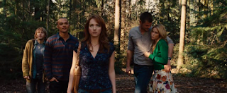
An example of a character that we would like to base our character profile on would be Dana from Cabin in the woods. Dana is a young and innocent girl who is forced to fight against the monsters in the cabin in the woods. Dana is a student who went on a trip with her friends. Typically she is an intellectual who will advise the group on what to do however they wont listen, she is not particularly a popular character however because she seems to be the runt of the group it makes it more gripping when she emerges victorious at the end. She is also friendly, caring and always trying to help. Her costume will be much like that of our characters. The main thing we've taken from her is her personality which we've applied to Kate, but we've based our character around all of her. She is pictured below.
Grace Andrews
Grace is played by Sophia Bush in a film called The Hitcher. She's also a fairly young female in the horror film. She's very strong but also fairly vulnerable until the very end where she acts much more brave and eventually saves herself, after having lost her boyfriend to the crazy guy who's the enemy in this film. She looks much like our character would, same sort of clothes and maybe a bit older but same sort of age. We've based Kate around this character as well, the stereotypical heroine girl who is useless at the start but then becomes stronger. She is much like girls from other horror films for instance like Dana above and so we've stuck to this film and made our character much like this. She's pictured below, like Dana with a gun in her hands, this shows that both of these characters are very strong, even though at the start they aren't very helpful and are very scared.

Kate
Kate will be partially based on dana, we would like to use the aspects of her which make her really adjust to her stereotype. The traits we will take are how she is young because this makes her seem more innocent. Innocence is a key part of her character because it makes the audience connect in a different way to her and support her more. Another trait would be how she is the "runt of the pack" this will make us feel sorry for her and make the film more dramatic. However as you can see she also can fight against the monsters quite well which we will also apply to Kate. In our film Kate is pretty much forced to go into the woods with her group of friends and then when everything goes wrong she is eventually saved by the Ghost Hunter Darius and they have a slight romance going on which helps us connect with this character.
Our characters costume will be fairly casual, and that of a teenage girl. She will be wearing fairly normal clothes and have the same costume throughout the film as once she enters the woods she doesn't change clothes and that's when you're introduced to her. Her costume will be jeans or leggings, a casual t shirt or top and then a jumper or coat with trainers. Vague ideas for this costume are pictured below, subject to change as to what is available to us.
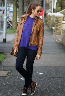
Our characters costume will be fairly casual, and that of a teenage girl. She will be wearing fairly normal clothes and have the same costume throughout the film as once she enters the woods she doesn't change clothes and that's when you're introduced to her. Her costume will be jeans or leggings, a casual t shirt or top and then a jumper or coat with trainers. Vague ideas for this costume are pictured below, subject to change as to what is available to us.

Subscribe to:
Posts (Atom)