Friday, 20 December 2013
Filming - Woods - Day 1 JB
Today we had our first day of filming in Sydenham woods. We ended up getting around two thirds of our filming done which is around what we expected. We filmed more than just our shot list so we have a few extra bits of footage we may use instead of the ones on our shot list. We started at 10am as planned and finished at around 2:30pm. It was hard to get everyone to show up on time but apart from one girl not showing up everyone was on time and arrived in suitable costume as well as behaving well. There were a few places we had to slightly change the location inside the woods because of wet benches etc. We are going to have to do one more day of filming in the woods, planned for Monday 23rd December but if there is rain that day we will have to reschedule.
Tuesday, 10 December 2013
Plans for Graphics EA
FONTS:
Here are some examples of other fonts I am considering using for our title sequence.


These are all great horror type fonts which Josh and I will be thinking of using for our title.
COLOR SCHEME:

We will probably be inclined to make our horror poster have a dark colour scheme with red writing, this tends to be the typical horror standard and it works to a good level. However this really does depend on the image we want to use for our poster, we will do some research into what images our target audience like best to find out.
 As you can see for the cabin in the woods title sequence they like to stick to the red writing for the colour scheme which works very well, it lets the audience know that it is a horror.
 FILTERS:
SOUND:
For our narrative titles we have a few examples of things that we might want to use, the sounds in these narrative titles tend to be quite simple such as a drum or a sudden sound. The cabin in the woods has a perfect example of the type of sound we want to use for our narrative title slides at around 0:46, it is a quick short sound which accompanies the text saying "You think you know the story". The same again happens at 0:54, this is perfect for what we are doing because it is quite easy for us to do and it can achieve great dramatic effect. Here is the video below.
MOVEMENT:


Movement is crucial in our title sequence, there should not be too much because they are supposed to be very quick points of information which get the audience involved and thinking. The examples you have seen from the cabin in the woods at times 0:46 and 0:54 are excellent ways of showing a narrative title, the way that only a bit of the writing appears at first and then the rest comes after, this builds tension and adds effect.
Monday, 9 December 2013
Research into industry of media magazines JB

On the Bauer Media website Empire magazine is described as
"the premier movie destination, providing indispensable insight into cinema, both blockbusting and classic. Online, in-print and via app EMPIRE’s unparalleled access has led to world-beating exclusives such as the first look at Heath Ledger’s Joker, to extraordinary access to Steven Spielberg who guest edited our 21st birthday issue, to George Lucas’s backyard in the run up to Indiana Jones and the Kingdom of the Crystal Skull."
Saturday, 7 December 2013
Little White Lies Magazine Cover Evaluation JB

Thursday, 5 December 2013
Title Planning JB
One film that has influenced a lot is The Cabin in the Woods. This title doesn't play much with anything and gives an overview of the film very literally.


Other films that are similar to ours are The Woods have eyes and Cabin Fever, who's titles are posted below


We are going to use these sorts of ideas for our title including the word Woods and giving them characteristics of a human we think is quite effective. Below are some title ideas.
"Don't stray from the path" with a tagline (or you may never return)
"The Deep Woods"
"The Dead Forest"
"The Dead Leaves"
"The Forest of Decay"
"The Forest sleeps" with a tagline (but it's inhabitant doesn't)
"The Fallen Leaves"
"The Hunting"
"Nightfall"
Poster Interview 2 EA
Below is an interview we conducted on 6 film posters that are similar genres to ours.
Organising Filming JB
I've created a Facebook group to get everyone organised and let everyone know when we're filming, where and who's playing who. This is shown by the photo below.

Wednesday, 4 December 2013
Poster Survey JB
60% of the people asked didn't like horror films, all of which were females.
40% of the people asked did like horror films, all of which were males.
The Skeleton Key -
When asked what most liked about the poster some answered with the eye image and one with the tree image. Some also answered that they didn't like the poster.
When asked what the poster made them feel some answered that it made them feel intrigued. Two people said that it made them not want to watch the film. Another said it made them feel worried for the person in the wheelchair.
Insidious -
When asked what most liked about the poster most of them said they liked the boy's eyes and the way the poster played with shadows and contrast of light and dark.
When asked what the poster made them feel a couple answered with annoyed/confused. One said it looked more like an alien film poster and the rest said it made them not want to watch it.
The Cabin in the Woods -
When asked what most liked about the poster most said the house image and the idea of it being like a puzzle or rubix cube. One also said they liked the brightness of the poster.
When asked what the poster made them feel most said excited or intrigued about the house. One said that it didn't make them feel much.
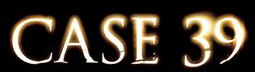
Case 39 -
When asked what most liked about the poster most of them said that they didn't like it at all and one said that they liked the simplicity of it.
When asked what the poster made them feel most said they didn't like it and it didn't make them feel much.
The Conjuring -
When asked what most liked about the poster most said they liked the simplicity of it and others said they liked the doll and the fact the only colouring is on her.
When asked what the poster made them feel all of them answered scared or creeped out.
The Blaire Witch project -
When asked what most liked about the poster most of them answered that the writing left them wanting more or the close up of the face was the best bit.
When asked what the poster made them feel some of them said intrigued about the writing or the symbol. Others said nothing at all.
The most liked poster was The Conjuring and the second most liked poster was The Cabin in the Woods.
When asked whether the fact a film is based on a true story makes them like it more 90% of them answered with yes as it makes it more interesting or scarier. One answered no because they said they don't really believe it.
When asked whether the names of actors/directors on the poster make them want to watch it more all of them said yes if it was an actor they liked or the director of another famous film or one they liked.
Tuesday, 3 December 2013
Poster Interview 1 JB
Below is an interview we conducted on 6 film posters that are similar genres to ours.
Script JB
We are going to have some talking in our film and so we've written a script below that we are going to roughly follow.
The first dialogue is between the policemen(P) and the ghost hunter(GH):
P1: There's been an accident in the forest, it's.. not.. ordinary
GH: How so?
P2: He means to say Sir, that we believe this to be a murder of the supernatural kind.
GH: Show me.
(On scene or voiceover)
GH: There's something wrong here.. I don't like this
The next dialogue will be the voiceover of one of the kids talking about the woods
"Did you guys hear about the jogger who died in these woods the other day? Some people say it wasn't human what killed him... I've heard stories about these woods. I've been told there's something that lives here who feeds on people. He picks on the weak first, and the ones who don't believe his tale, he hides in the trees and in the bushes and when your guard is down he STRIKES."
Schedule for filming JB
We have decided to film during the following dates: 19th, 20th, 21st and 22nd of December.
We've checked all our cast members are free during this date and we should be ready to go to start filming. We've got our equipment including:
Camera
Tripod
Two Lights, each with two battery packs
Audio recorder
Directional mic + extension pole
Headphones
We've checked all our cast members are free during this date and we should be ready to go to start filming. We've got our equipment including:
Camera
Tripod
Two Lights, each with two battery packs
Audio recorder
Directional mic + extension pole
Headphones
Different ideas for ident EA
I have decided to call our indie company Fairly Frightening Films primarily for the alliteration but also because it has some comic value. For my first idea I was just getting the feel for motion, motion is a professional package and can be quite difficult to use.
As you can see from this small clip it is not particularly well made however there are a few different parts of motion which I began to experiment with. To start I took an image of a knife off the internet and put it in motion. After this I wanted to see what i could do with text so I created a text box and wrote 'The Woods' in, this is because Fairly Frightening Productions would have been too big. I added a 'drip' effect to the text and then changed the glow to red, this made it look like blood dripping. Another reason I did not use Fairly Frightening Productions was because there were too many letters and the dripping got a bit out of hand. Finally I made a custom animation where I drew a motion track line and then attached an image of a light to it. The light grows and shrinks in intensity and size as it travels up the knife.
My second ident is not as creative because I already made my own template from earlier when I was just getting to grips with Motion. All I had to do was adjust the length of the animation, change the text and add the bad film effect to the text so it fits in with the picture behind.
For my final piece I was intent on getting blood involved because it makes it much more scary, this is probably the most simplistic of all three however I feel it is also the strongest. Used Final Cut Pro to create the animation for the text and saved it as a video file on my desktop, I imported it into motions as a piece of film and then used a free blood animation which I found on the internet and layered over the text.
Influences for Graphics EA
The Conjuring:

The conjuring has a more documentary style title sequence which can be incredibly effective, especially considering that the conjuring is based on a true story. The documentary style title sequence tends to have a grayscale color scheme, this old fashioned technique can be quite fear enspiring. Moreover it is usefull to get out as much information as possible in a short amount of time setting the film up, introducing the plot and characters. The font in these slides are all easily read except the titles of the pages, which are not particularly relevant to the cast and directors however it is of use to give background information on the plot line hence lines like "haunted artifacts museum".
Cabin In The Woods:

The cabin in the woods is set in a wood, however the title sequence does not show any of these woods. As you can see the title sequence is used to establish what is going on, therefore they show the interior of the organisation behind the intricate murders of the youngsters. The text is very legible and tends to be in block fonts which are large and attention grabbing. Moreover the text tends to be all rather central which makes it even more captivating. The colour scheme has a re-occuring red theme which is the typical 'horror colour' seen as it is the same colour as blood, we also see black, blue and grey. The blue and grey are for a more satirical approach to the horror genre as it tries to illustrate the lame life these workers lead in comparison to that which you experience later in the film.
Evil Dead:

The Evil Dead title sequence is very typical for a horror, the colour scheme is red and black which are both fear inspiring and signify blood and darkness. There is a lot of blood in the title sequence which I think we would be able to animate for our title sequence effectively. I have tested some blood animations in motion which seem to work well. The text is large, not particularly central and in block capitals. The reason they have not made it all central is because they don't need to, the titles are attention grabbing enough with them being in bright red and capitals as it contrasts from the black background, also the animations which appear centrally are important and provide the eerie horror feel to the sequence. The title of the film has looks as if it has been scratched away which provides a really nice look which I would also be interested in experimenting with or perhaps even using.
Subscribe to:
Posts (Atom)